
I am a web designer and developer currently working as a full-stack developer at Hardin Design & Development in Madison, Wisconsin. I graduated from Southwest Wisconsin Technical College in 2019 with an A.A.S. in Graphic & Web Design and attained a B.S. in Computer Science from the University of Wisconsin - Platteville in 2022.
Having been described as a proverbial “unicorn” by my instructors, I am both creative and analytical with a broad, diverse skill set. I specialize in and have a particular passion for designing and developing beautiful, intuitive front-end interfaces. I also have experience with back-end development, software engineering and graphic design. Additionally, I am an extremely proficient writer, a dedicated worker and someone who just generally likes to get things done in the best manner possible.
I am elated to be able to share my portfolio with you and hope to be in contact with you soon!
Please take the time to peruse my portfolio. These are some projects which I am particularly proud of and thoroughly showcase the full range of my talents. If you are particularly fond of a work or have any suggestions (I strive for constant improvement), please feel free to contact me.
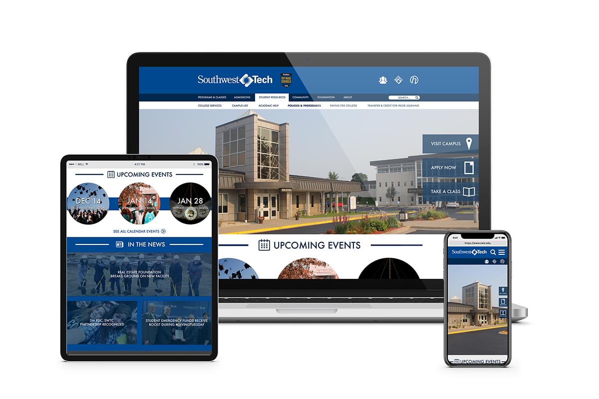
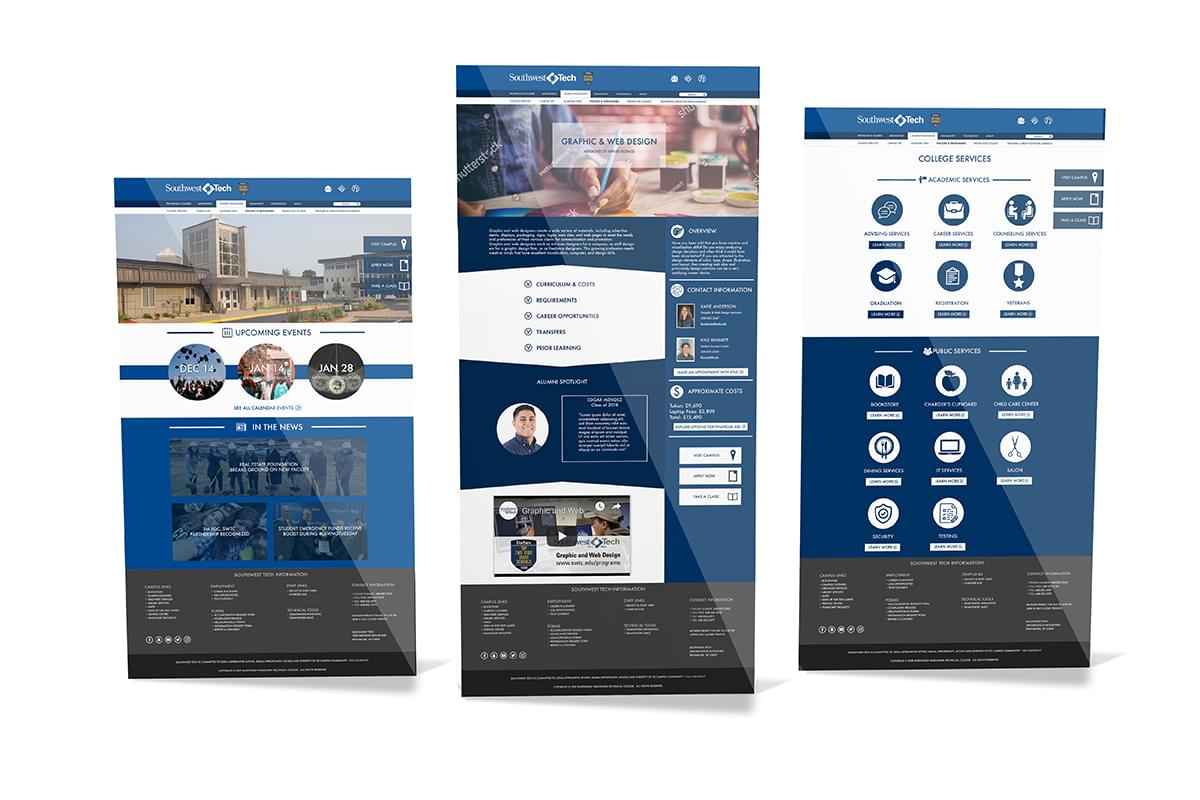
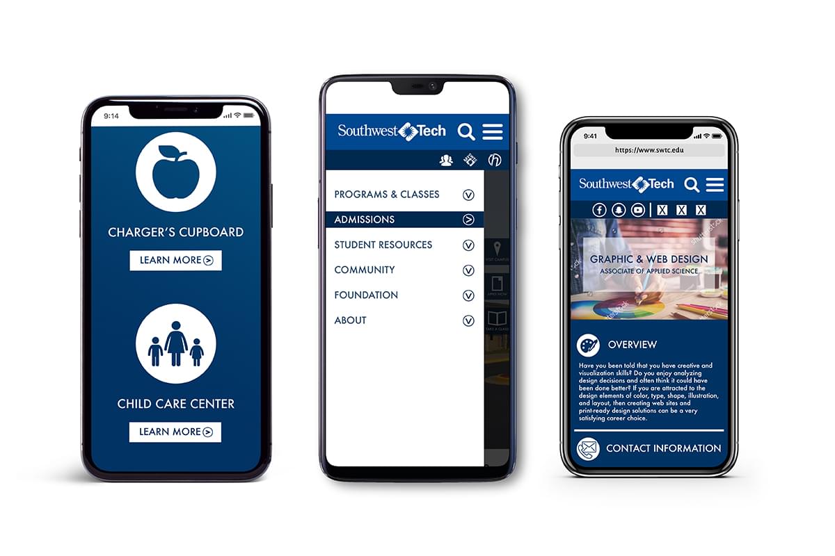
My crowning achievement, I was given the opportunity to work on this project while employed as a student worker in Southwest Tech’s Marketing Department. The college wanted a refined, modern look for their website that maintained the consistency and integrity of their brand. To achieve this, I gleaned inspiration from educational sites across the web to create an experience that was simple and intuitive, yet visually appealing and engaging. I developed a conceptual look for the entire site as well as full-page layouts for the program, college services, and home pages. This site is responsive across mobile, tablet and desktop platforms. After presenting my initial comps to the Marketing Department, I presented the design to the college’s executive team for final approval. I created the compositions in Illustrator and also assisted in building the website in Visual Studio.
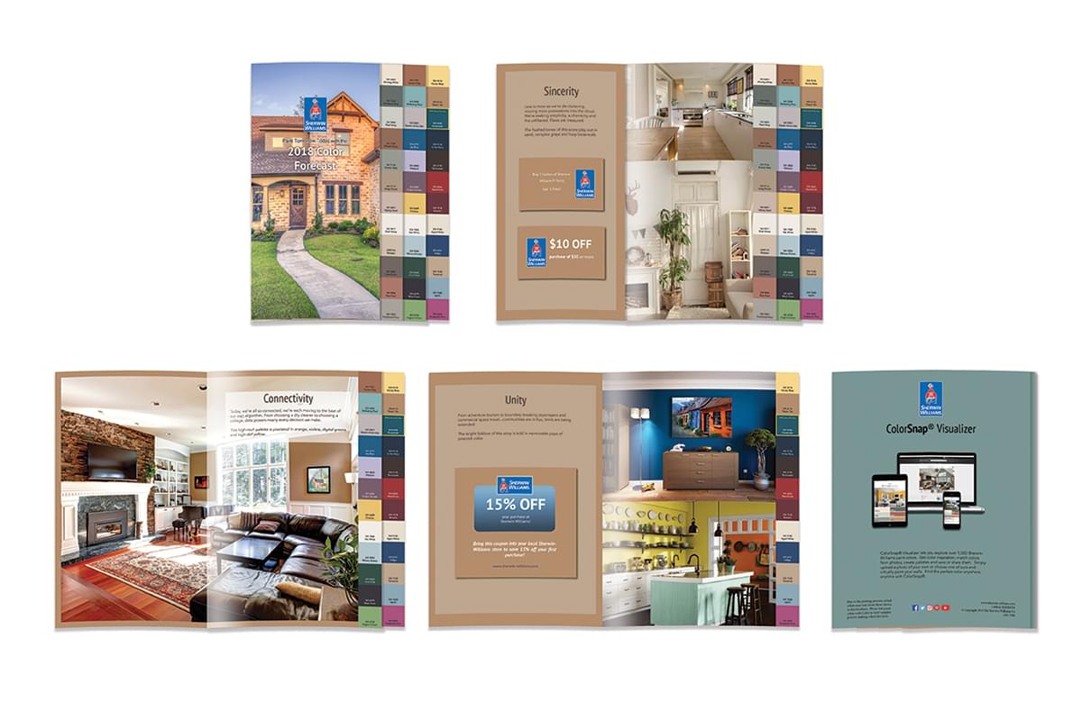
This is a custom product catalog that I created in InDesign. It promotes paint and building materials firm Sherwin-Williams’ paint collection- The 2018 Color Forecast. I first developed a functional prototype, then laid out the material in InDesign. This was an intensive project that necessitated a good amount of critical thinking in addition to solid design fundamentals.
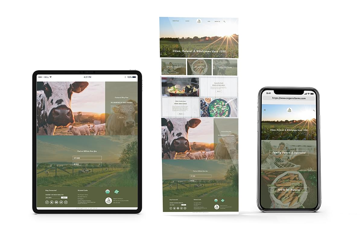
My client for this project was Organic Farms, a family owned and operated organic agriculture start-up. They wanted a website that was clean, refreshing and expressed a healthy, organic tone. I completed this project in three phases- first, I researched the websites of Organic Farms’ competitors and related companies and made a branding board of elements that could be used in the site. I then created a wireframe, roadmap and designed the final comp in Illustrator. Finally, I implemented the website with HTML, CSS and Javascript. I utilized the Bootstrap CSS framework to style the website.
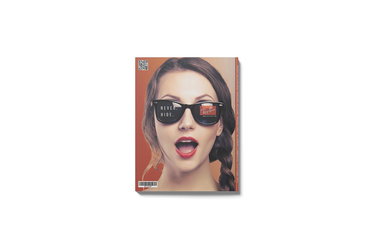
This is a magazine advertisement that I developed to promote sunglass brand Ray-Ban’s “Never Hide” marketing campaign. The client requested an advertisement that appealed to younger, more affluent consumers across gender lines. The tagline “Never Hide” conveys the message that the sunglasses represent who the consumer is and that they should never be afraid to be themselves. I brainstormed several different design concepts which I then turned into sketches. After the client approved one of them, I used Photoshop to create the final advertisement.
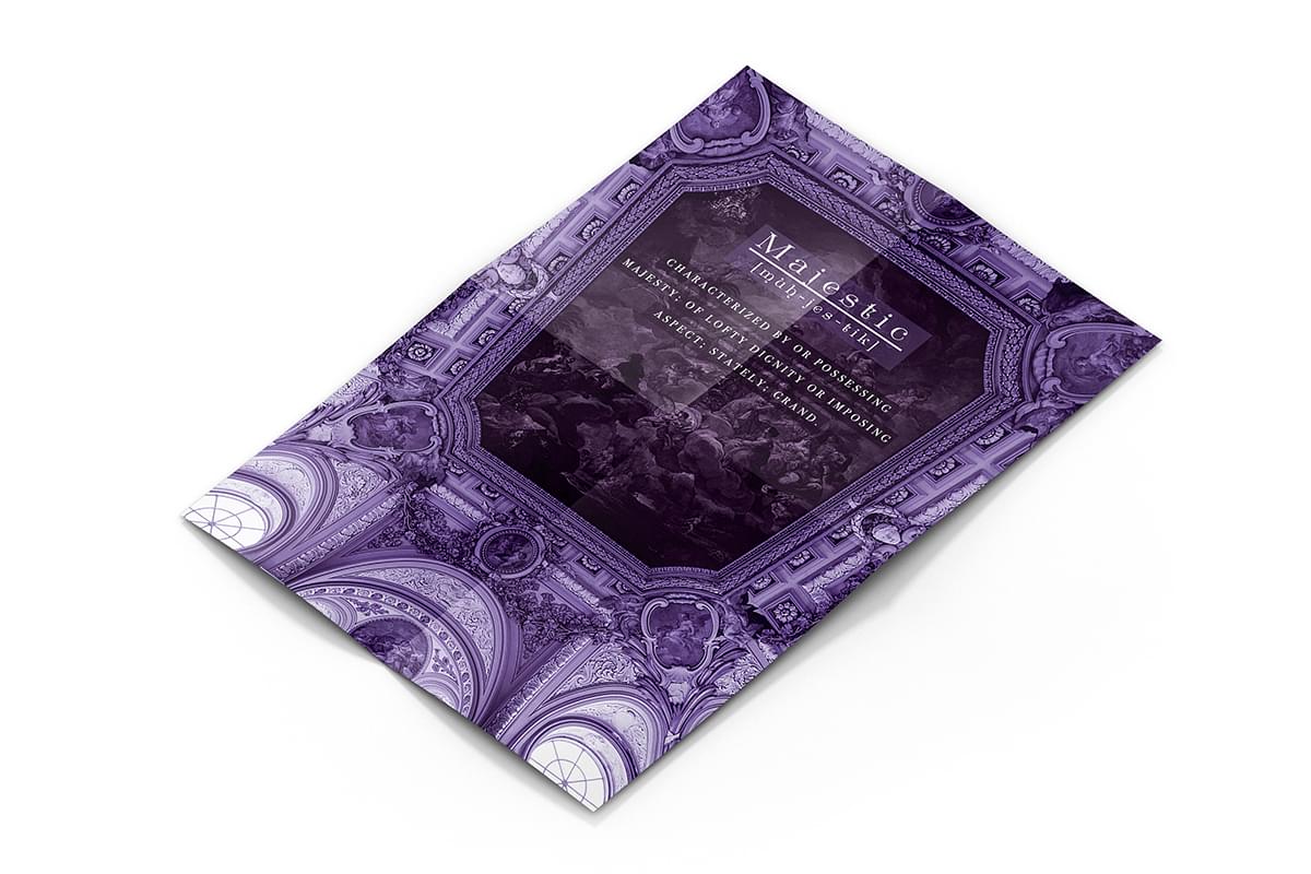
The color purple is associated with luxury, prestige and majesty. I was tasked with creating a poster that combined imagery with this hue to exude such a mood. After sketching out several designs and considering many different photos, I created this piece in Photoshop. One of my more truly artistic pieces, it captures the essence of the purple overlay and combines it with the sheer beauty of the architecture to create a tone that is truly majestic.
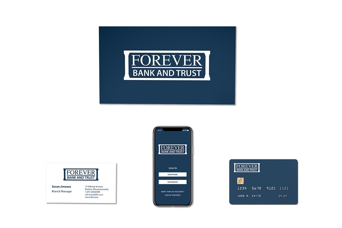
Forever Bank and Trust is a modern, serious bank that desires to market itself to the younger generation. The client requested a serious logo and color scheme that conveyed dependability, seriousness and trustworthiness. After a creative brainstorm process that involved selecting appropriate typography and color schemes , I sketched several designs and took the best candidate into Illustrator to finalize the logo concept. The design can be utilized in many areas of the bank’s branding, including, but not limited to- business cards, banking statements as well as web and mobile applications.
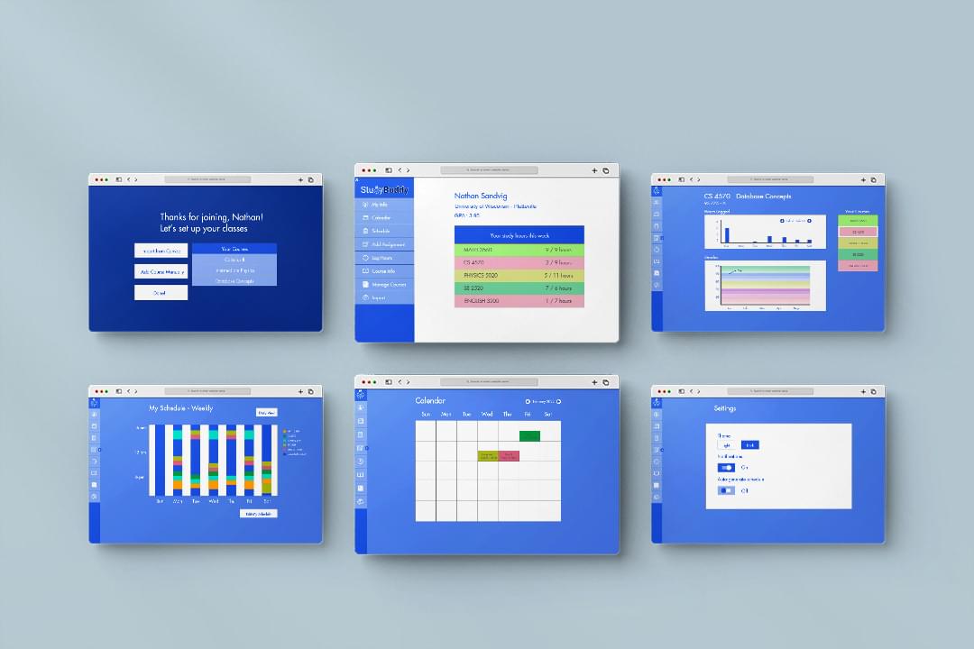
Study Buddy is an application intended to help students manage their course work as well as algorithmically generate an optimized study schedule for them. It is built using C# and Windows Forms. The program was engineered using the 3-tiered architecture design pattern (Data Access, Presentation, Business Logic).
As a member of a small software engineering team, I participated in all Agile activities including Scrum, Daily Standup, Sprint Planning and Sprint Retrospective. I contributed to the overall application design and was specifically responsible for designing the User Interface as well as implementing the bulk of the front-end. While the UI is not necessarily optimally “pretty” by conventional standards- it is simple, straightforward and intuitive in order to meet the needs of the primary user persona- namely college students.
In order to adhere to Object-Oriented Design Principles and ensure that my code was reusable, extendable and efficient, I implemented the Model-View-Controller pattern within the Presentation layer.
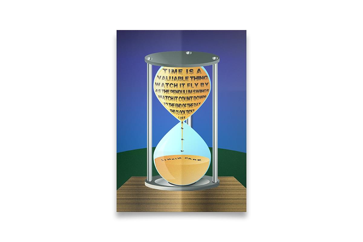
My client requested a typography-heavy, vector poster using lyrics from a song. I was given a good deal of free reign over the mood conveyed and lyrics chosen. I chose this snippet from the song “In the End” by Linkin Park to express a subdued, heavy feeling. I supported the tone and theme of the lyrics by transposing the typography on an hourglass and slightly warping it so that the words appeared to be gradually slipping away- acting as a visual metaphor for the way time seems to slip away from people.
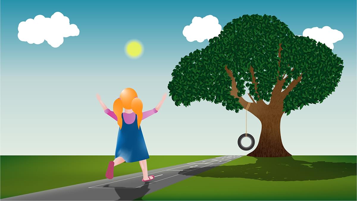
My client for this project was seeking a logo for their proposed start-up television network- Skipper Productions. I was provided with a general plan as well as a rough sketch of the design concept. After improving upon the pre-existing sketch, I went to work in Illustrator. I used Adobe Capture to bring my drawing of the girl into the software and then vectorized it. I created the rest of the scene primarily through use of the pen tool, gradient meshes and freeform gradients. The client would eventually like this piece animated for use as an introductory animation on their network.
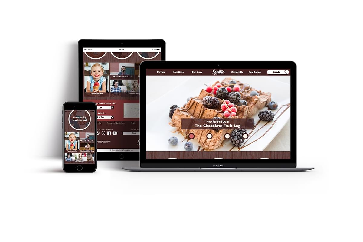
This is a website I created for Sprinkles Ice Cream, a family-friendly national ice cream chain. It is a fully responsive site built strictly using HTML, CSS and Javascript without the use of any frameworks or libraries. This project was accomplished in three phases. During the initial phase, I researched relevant competitor websites and created a moodboard with possible color schemes, fonts, textures and imagery to provide the client with some guidance. Once they decided on a proper direction, I devised a wireframe and roadmap of the site and built a static comp in Illustrator. Finally, I developed the site using Visual Studio Code.
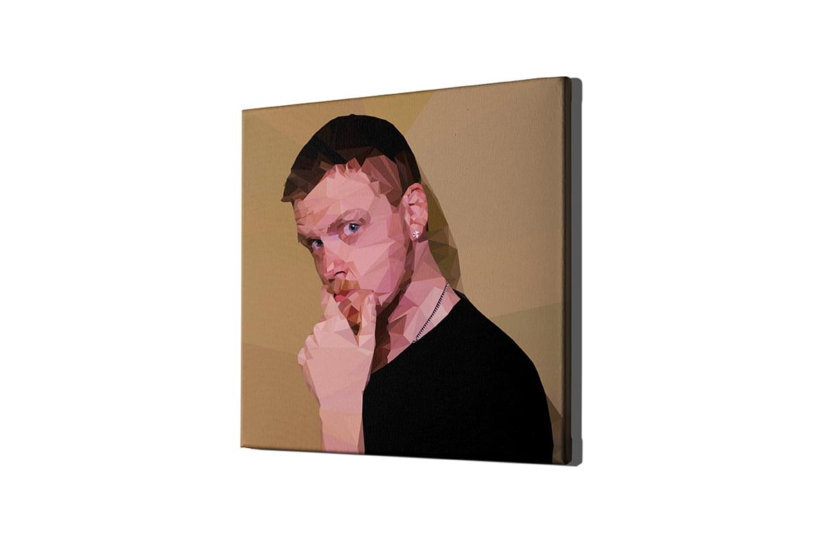
This is a personal project that I am quite proud of. I created a low poly illustration of myself in Illustrator using only triangles. I took a photograph of myself into the software and traced an outline. This was quite a time-consuming project that taught me a great deal not only on technical Illustrator skills, but also on the importance of patience.
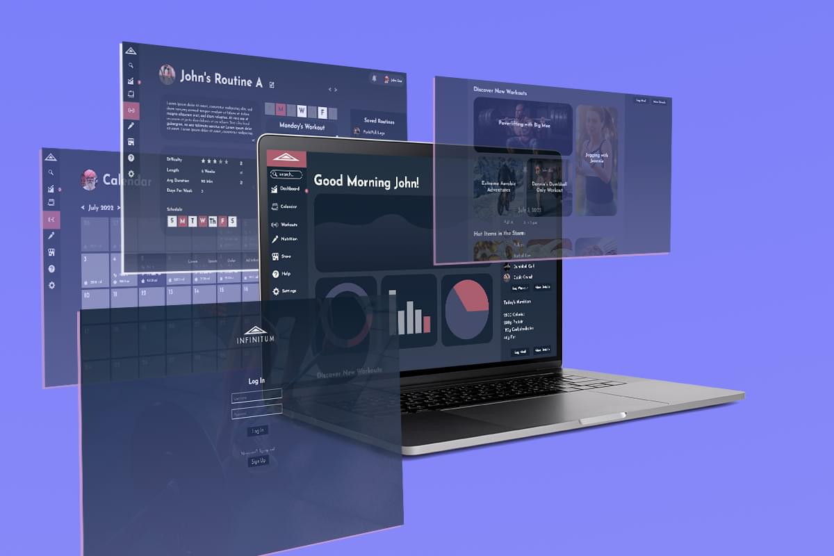
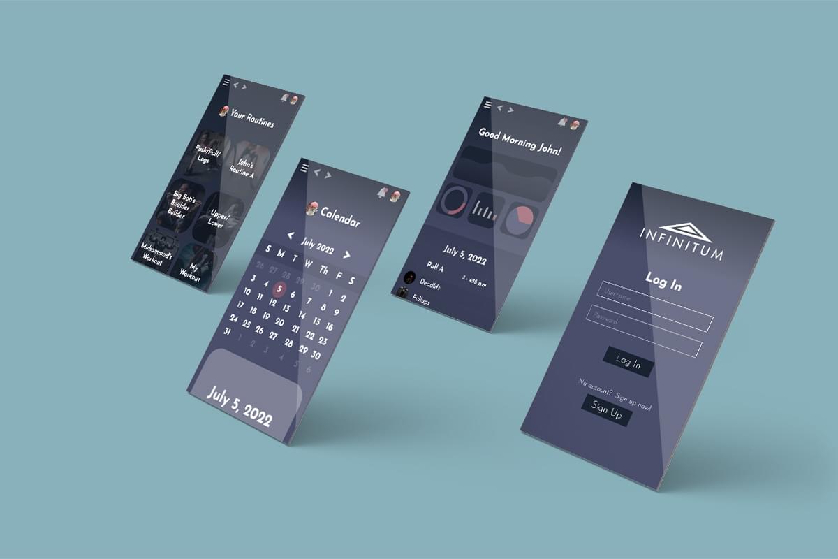
Infinitum is an in-progress personal project that has allowed me to meld my passions for UI design, software engineering and fitness. It is a fitness web application intended to allow users to input and visualize their data as well as create custom workouts and routines.
The UI is designed to be modern and sleek, with a heavy use of gradients and transparency. I was heavily inspired by the user interfaces of Spotify and the Canvas Learning Management System.
This project has evolved through 2 major iterations. I initially set it up using server-side rendering via Node.js, the Express framework and Embedded Javascript Templating (EJS). The front-end did not employ any frameworks, though the Charts.js library was employed to graph data.
After recognizing the difficulty of implementing such a large front-end from scratch, I opted to restructure the project using React on the front-end as well as headless architecture. I decoupled the server and client code by creating 2 separate Node projects. The backend now simply communicates with the frontend via API calls and is not responsible for any rendering. The front-end employs React Router for client-side rendering.
